Some tips on promoting your band or function.
is perhaps the most obvious hook, like the chick draped over the sportscar, but obvious hooks are to be avoided because they start out as a cheap trick and need a damn good follow-up in the detail to offset the feeling the reader has been sucked in.
A Melbourne band called Robert Trimboli's Hat featured a trilby on their posters but the name tended to clutter the poster, so they soon dropped the name and posters appeared with only the hat and words like “Punters, Thurs 16th” written in felt-tip pen below (The Punters Club being the name of a local hotel rock venue).
My personal favorite was a handbill, half A4, from Anthill theater in Melbourne. The face was filled with only three words in heavy block type, “TARTOUF, MOLLIER, ANTHILL”, and a small ant half off the page going around the back. The effect was magnetic, curiosity making it almost impossible not to pick up.
On the back we learn that Tartouf is a play by a French playwrite Mollier which is being staged at Anthill, from columns on the author, the play, and the production and booking, all set in fine print.
This can be done on the face-only for a poster with the basic 4-W's in large type and very small type detail in a paragraph under each, so it works at a distance but contains detail for interested readers. Festival posters that have to contain a lot of information work in this format.
So whatever your poster says or is about doesn't matter a toss until somebody stops to look more closely and read it, and to grab their attention and stop them long enough to read the rest is the function of the hook.
Proofing
Proofreading your poster text is vital and should be passed by as many people as possible once finished but before reproduction. If you send it out to a printer for layup they will send you a proof copy to authorise before the print run. If you miss an error at this stage, and many do, it's entirely your responsibility. Yes, I once authorised 35,000 handbills with the phone number missing, so it was all night with a rubber stamp for me.
If you made a mistake early in the process you are likely not to see it no matter how many times you look at it, while another person may spot it instantly. Get somebody outside the process to double check name spellings, dates (that Saturday is the 14th, not actually the 12th), phone numbers, web addresses and so on.
Visiting some friends who were into signwriting I was inspecting some of their drying work. “What about this one?” I asked. “What about it?” “Well there's a letter missing from the main heading.” Over the next ten minutes half a dozen people examined it intently and couldn't find what I was talking about, starting to think I was winding them up. Even after I told them it read “Learn to Ride a Motorycle” they still had trouble seeing it, so well did the design make the eye flow over it. They did the same to the client who was happy to pay after he couldn't see it either, saying “nobody would notice”, but a steady trickle of people proved him wrong.
Fonts
Computers can help a lot with poster artwork preparation, but a common newby trap is to try and use every available font type and size. Some fancy fonts are almost unreadable even with close attention such as computer-style cheque writing, which is fine if you want a computer to come to your gig, and heavily illuminated or decorated fonts such as old-west or gothic styles. Mind you, if you're a Gothic band that's your schtick and you're schtuck with it. Times Roman and it's variants are still the most popular for newspapers and so forth for good reasons.
Apart from handwriting or script styles, fonts come in two basic flavours, serif and sans-serif. A serif is the little kick outwards at each corner of the letter, sans (without) serif have square corners. But if you look closely at the work of a good signwriter you will see that even sans-serif lettering still has a tiny kick in the corners, and if you ask they will tell you that the letters look rounded from a distance if made exactly square. As one printer put it to me “the serif stops the eye sliding off the letter”.
Size matters
Many cafes and milkbars are happy to let you put up a poster, but not if it's the size of a bedsheet. Standard A4 works well, but half-A4 can work just as well and fit in more places. The prime area in a milkbar is just below the door handle, but it's also the most popular, so a smaller poster has a better chance of being placed where it will be seen, in fact being placed at all.
In one cafe with walls papered in posters I witnessed the owner refuse and ridicule someone putting up for the Australian Opera whos' expensive multi-colour poster was over a meter square. No chance. With a poster that size the options become very limited.
Be prepared
Many shop and cafe owners will say “give it to me, I'll put it up”, but they often don't and it may be a brush-off, so offer to do it then and there. Have easy-to-remove tape such as crepe masking tape with you, and offer to put it up where they indicate. If you check out the door and window for out-of-date posters first, a bit of haggling and an offer to tidy the poster display up may get you a prime spot, but don't just screw them up, hand them back to the shopkeeper so they can check the dates themselves.
Have a pad and pen and record where you get knocked back (rare) and where you put them up. There is nothing like coming back after the gig to remove your old poster to get a welcome back next time.
Many shopkeepers are bothered by hawkers trying to sell them something so your opening needs to make it clear you're not. “Hi, we're putting on a show (produce poster and place in front of them) would you mind if I put this poster up?” works for me. Give them time to read it. Often they will then offer you tape, but have yours ready and say it's okay. Try to take a knock-back gracefully - the daughter may have just run off with a drummer, or worse joined a punk band as a dummer, and your green Mohawk and nose-bone don't help.
Lead time
You need to get your posters up sufficiently in advance of the date to give people a chance to see it, but not so long it will age and maybe get covered by another. For bands a couple of weeks is about right, but for festivals and such a month or more is good. For longer-term posters you will need to go around every week or so and refresh those you have lost. Bands that do a lot of gigs on short lead times tend to use a single generic design with a blank box below that gig details can be written in, and can even list several upcoming gigs.
Where?
Try to find a captive audience. Cafe walls are good, fast food shops where people have to wait for their order, the back of toilet doors, and particularly laundrettes where the sort of people who see bands often go and spend time reading the walls. With festivals I found the best place to get in contact with the Great Unwashed is laundrettes.
Many colleges and unis have extensive notice boards but often require that posters are dated with their stamp and will remove those that aren't, so observe and ask first.
“Why do you rob banks?”
“Because that's where the money is.”
Anywhere that has a notice board is fair game for a try, but a poster for a biker-thrash band will get more traction in a motorbike shop than in a maternity wear shop, yet people waste their material like this all the time.
In many places postering in public is now illegal so it is not uncommon to see a couple of furtive folks in long bulging coats working from pole to pole along popular strips. It takes only a few seconds of co-ordinated effort to hold the poster up against the pole and run a roll of clear sticky tape around the pole a few times. Council workers come around regularly and gaff these off again, so I am dubious the potential trouble is worth the extra exposure over shop windows.
Etiquette
If you have to put your poster over another, which you often have to in cafes, ensure that you only cover out-of-date posters or you will find other posterers and even cafe owners will rip them down again.
Some popular bands find their posters are so collectable they can't keep them up. One response to this (happy) situation is to pre-slash each poster diagonally across the middle to make them un-collectable
Colours
These days there are many storefronts large and small that do instant printing using photocopier technology (rather than offset printing). One of the tricks they can do is printing in colour but this is generally far too expensive for a mass of band posters.
An alternative is to print on coloured paper, which they will also do, but which is only a bit more expensive for the colour stock or paper. And what a lovely selection of colours they have!
The problem is that only a few colours actually work under black printing, and they all must be light or very light. People also find warm colours more attractive than cool colours. This leaves yellow, pale straw, light orange, light red, and any others similar. Forget dark colours, greens, and particularly blues. Under most artificial light black on blue or green tends to go all black.
Plain white is stark, but it is that very starkness that gives it the highest impact - all the colours that strike it are coming back at the viewer.
 |
 |
|
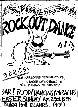
Gig outcome: success. The simple line drawing of Wok out Wabbit tells it all at a glance. |
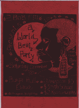
Gig outcome: failure. A lovely artwork, but lost on dark red, too busy and more suited to a greeting card. |
These two are hand done, but just because a computer can produce a neat-looking colour end product easily, don't assume that means you know what you're doing, or your poster will automatically work.
The “Wanted” poster comes close behind “sex” as an obvious hook, but here's a variation that demonstrates that having a computer isn't enough...
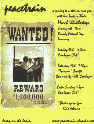
What's the name of the band? What's the hook? Where's the focus? (And where's the phone number?)
The bright area leads the eye downward to the photo and the biggest word is “wanted” (so that must be the name of the band). These combine to lead the eye away from the name of the band at the top in a script font with zero impact anyway, could be a decorative squiggle. But that doesn't have to be, and genuine handwriting can have impact.
The photo we are led to has to be smaller because of the Wanted poster around it, which only highlights its own typical amateur problem of loose framing. The faces are specks way in the distance when they are supposed to grab you with eye contact.
Here the group are posing too spread out and apart from each other. The original has to be shot in tight close-up to catch face and eye detail, then cropped. Cropping to concentrate on the faces of the subjects is important in posters and newspapers, and even moreso on web sites which need photos to be savagely cropped.
“Reward” is the second strongest word so the eye is led even further away from the band name. The poster that works is the Wanted poster alone, not the whole.
The real hook, such as it is, has been buried in the second line of the unreadable text - “Roots n Blues”.
Putting a strong poster over your own weak band poster is being “very couragous Minister”.
Cards
Business cards are corny, cheap, and effective, even as “posters” on notice boards.
Because of the smaller format some colour is often affordable and can make the card more attractive.
Press releases
Most newspapers and magazines receive dozens of press releases every day, often by fax. Your first problem is how to get noticed in the crowd, and then to get published as fully as possible.
The more you can make your item ready to simply drop in, the more likely it will be. Look at the style of the papers you are trying to get into and imitate it. Expect the paper to “top and tail” it and possibly “cut and shunt” as well.
In the first some journalist will write an initial paragraph or two and an ending par, in the second if it is too long sections may be dropped from the middle. Make this easy and control overall sense by writing each paragraph as a self-contained piece that can be chopped without turning the whole into nonsense. That's why it's sometimes called “sausage journalism” - they cut off as much as they want. I think of it as a rather turgid writing style - “This is Spot. Spot has a guitar. See Spot jump.”
The first word is particularly important as a hook because it is frequently set in bold and much larger type than the remainder, so starting “The...” wastes a golden opportunity.
  Brassy, big, and bold.  Barrel House Deluxe big-band energised the

2BOB Ball from the floor of Wingham Town Hall on Saturday night.

“The floor?  We're too big for the stage!” quipped vocalist and

popular 2BOB presenter Helen Knight.  Guests danced the night away

to selections from the Roaring 20's, Blues, and a taste of Soul.


B.H.D. is an occasional project by members of local bands The Hip

Pedlars, The Chinese Fighting Chickens, The Blue Sliders, and

featuring the mellow and melodic D.C.Brass.

...
Don't mistake a press release or review with reality. For example; I didn't actually attend, I invented Helen's quote, only 60 people turned up of an expected 200 in the worst attended ball of its history, WTH is a huge cold barn, one member of the band was on strike, another had to jump off stage and turn the foldback on because the mixer had fallen asleep, they had lights right in their eyes all night, the food was only average, but hey, this is showbiz!
Every night on the TV news there is a medical breakthrough story complete with visuals of lab techs, flowing pills etc. This isn't news, its a pre-packaged advert from a drug company ready to drop straight in to the TV news as an alledged item. In fact apart from air crashes, floods and bombings, everything else in the news is somebodies pre-packaged advert dressed up as “news”. This is the dark underworld of the PR flack and the spin doctor.
When the drummer collapses drunk mid-evening and the lead guitarist is way too loud the review becomes “Even a member down due to sudden illness the band was formidible”. You don't tell them “there was lashings of wonderful country grub” available because nobody turned up to eat it. Copywriters dwell in a parallel universe like a Valium cloud where nothing ever goes wrong, or if it does it's minor and funny. When punters are barfing out the back it becomes “Despite catering problems...”, the crew must win through and have a happy ending.
Again the 4-W's apply (note the first par above). Text should be double-spaced between lines and triple-spaced between pars. Number pages and don't split pars between sheets.
If you are sending by fax then consider using a computer to send your text directly as it comes out squared up, better looking, and more readable at the other end, giving you an edge on those who simply fax from a machine.
If you are sending by e-mail send your article as the body of the message in plain unformatted text such as NotePad produces, not as an attach since many newpaper e-mail systems simply reject all attaches on sight. E-mail is better than fax in that they don't have to type it up, but it's still not as reliable as fax or print/post. They don't want to know about your ideas for formatting, they just want the words in the right order.
Be aware of the deadline for the paper, often given somewhere, and get in well ahead because you certainly won't get in after - production schedules are strict.
A release must have a call-back number, better a landline than cellphone, and name, and that person must keep themselves available.
Journalists are public megaphones so don't tell them you strangle chooks for fun unless you want to read about it over breakfast. “Off the record” is useless to a journalist and “unattributed background” only marginally less so. Understand that “off the record” applies, if at all, to what is said after, not before, and “between you and me” etc isn't off the record. Besides, you're not important enough to make it stick anyway, so if you don't want it reported, don't say it.
In interview expect to be asked pointed, awkward, confronting, and seemingly dumb questions. This is only what journalists do, it's their gig. Try to take these questions with a straight bat and a bit of humor and remember that “musical differences” is shorthand for “I'd rather not discuss the drummers upcoming court case” or whatever, but like a Joker you can only use it once per interview.
The major daily papers are hard to crack unless you've got a cure for cancer or a two-headed chook. Major regionals will often do a total rewrite while smaller papers will run part or all top and tailed, and a few verbatum. I've had items cut off in the middle of a word to fit a column by length, so get the facts in early. Many papers follow the “tell them, tell them, then tell them again” format which means the whole story condensed into the first par or two, repeated somewhat expanded, then repeated in detail. Check your spelling and word meanings carefully because they won't.
In fact the real secret of all writing isn't the writing, it's the RE-writing, yet people submit and put up on the web writing that they obviously haven't even bothered to re-read themselves. Getting it down is only the start and many writers of all sorts affirm the real business of getting your text to say what you want, not just its meaning but its lyrical quality, is in the re-writing. And because of the tightness of space this is particularly true of writing newspaper copy.
Apart from pre-show publicity another tack is to write reviews of your own shows from a third-party perspective, where the focus is the overall gig but you just happen to mention your band and where it will be playing next. If you're smart you'll give equal weight to any other bands that played as well. The example above concluded with several contact names and numbers - you can only hope the sub-editor doesn't cut them.
I developed a music column in a local paper simply by sending them reviews out of the blue, no pre-arrangement. I've never even spoken to anybody on the paper yet they run my items verbatum because I try to satisfy their needs to fill space and provide something they can simply drop straight in or only requires minimal editing. The more work they must do the less likely you are of getting in. I always supply a heading or title but they are rarely used, so the choice of the first word becomes critical. In the example above it took a long time to arrive at “Brassy”.
Tapes, CD's
Writing about music is one-order removed from the reality, and door sales of CD's and tapes are a very effective way of getting your music directly to your potential audience - the friends of your current audience.
Some bands are even burning a track or three on some blank CD's at home, printing a liner, then putting them on the counter of the local Web shop or Net cafe as give-aways.
Don't dismiss cassette tape, particularly if your band is short on money and technology and long on time. Boxes of short tapes in bulk can be got much cheaper than blank CD's (that will actually read, that is).
And check that your CD's actually have something on them before you hand them out at Tamworth, not 3:24 of dead silence. This was actually a professional studio putting themselves out of business but I've seen a few home-burned CD's with serious problems, so check each one will actually log in and start to play in a cheap ghetto blaster or all your hard work will end up de-promoting your band.
Web site/e-mail
These days a punter is more likely to ask you for your web or e-mail address than your autograph.
Web sites have a huge potential to promote a band, but the site itself has to be promoted to do that.
In fact all elements of your band promotion need to support the others. Your web address should appear on all your printed material, particularly CD or tape liner notes, and the site should have your free tracks for download. To keep track files to a reasonable size they have to be converted into MP3 format and this has some traps. All tracks do not MP3 equally, some convert well, others the entire balance of the mix is altered, so you need to chose a few and see how each travels. Some systems allow you to create a file that has a limited lifetime - don't do it. Choose what you will give away and do so freely.
A gig guide keeps people coming back, but only if you can find the time and energy to keep it up to date.
Photo galleries of the band in action, or out of action, are great, but not on the home page please. Keep your home page tight and quick, not a 40 minute Flash animation download if you want anyone to actually see it.
Copyright
This is a huge topic on its own and anybody who is performing or creating needs to have a firm grasp of the basics of the legal framework they are doing it in.
There is much confusion about copyright law in Australia with many people thinking we are under American copyright law. The default situations are opposite; in Australia even my shopping list is an “artistic work” and automatically subject to copyright. In America (my understanding is that) it's in the Public Domain until copyright is claimed by adding something like “Copyright © 2005 R.Roper”.
Copyright is independant of artistic merit. “Milk, bread, and toilet rolls” may be the shortest and worst play or poem in history, but you own it the moment you write it down.
And like any other property you own you can give it away, hire it out, leave it in your Will, and sell it.
One publisher wrote to me asking me to assign copyright in an article I had written for them, to them. Sounds innocent. They only want to publish it in their magazine, right? And that's what you wrote it for.
So paste this in your hat. In copyright jargon “licence” means lend or hire, and “assign” means give or sell. If you assign a work for nothing you give up all interest and control in it and give it away as a gift.
Don't confuse this with giving copies of your CD away for free. What you are doing there is giving away a licence, not the rights to the work.
What's the new so-called “Free Trade Agreement” between American and Australia got to do with it? Something about sugar wasn't it? Boring old politics.
Well the FTA brings in some major changes to our copyright situation. Copyright is a property right, but the property wears out and after fifty years expires. Licence is also for a limited term.
Donald Duck™ is getting on a bit these days, in fact Disney's copyright on many of their major characters was about to expire and Mickey™ would be making a break-out to freedom in the public domain. But this would mean an industry with a billion-dollar turnover would go down the gergler.
“Create new characters? Are you mad? EXTEND COPYRIGHT 40 YEARS! Impose it on the rest of the world through Free Trade Agreements.” And that's what they got.
While it is not required and has no standing in our copyright law appending the American copyright form to your material might remind those who sample others works that the Austrailian Performing Rights Association, APRA, continues to successfully extract large lumps of profits from those who do in retrospective licencing fees.
I think the sampling brought on by the digital age is an exciting musical development, but it depends on the creativity of the sampler, and when your track is 95% a classic Who track you just messed up a bit, you must expect well deserved trouble.
Further reading: Words and Law; Golvan, Colin, Penguin 1989, ISBN 0 14 051231 4; Dewie: 343.94'0780705.
Mailing list
A more intimate way of keeping in touch with your audience is to build up a mailing list.
This can be e-mail, snail-mail, or both. Details can be collected at the door along with CD sales, and a little sign helps to prompt the interested.
Accuracy in getting their details down in a readable form is very important.
If you want to keep faith with your audience, keep your mailing list under tight control. There are people out there (including well-known vitamin manufacturer Blackmores) who would really like to “just borrow” your list for various reasons, none of which will do you any good. Let them collect their own list without your help.
Stickers
A group in Melbourne who were into the (illegal) exploration of the drain system called the “Cave Clan” used rubber-stamped sticky lables to very good effect to promote their hobby and find new members.
As a result most were young urban cavers, but many were average men and women of all ages and occupations with a common interest in the hidden infrastructure of a big city. Even TV crews.
There are a wide range of sticky lables but beware coloured and glazed ones as the ink won't stick and will smear.
Sheets of lables are also available suitable for feeding through a photocopier and this works somewhat better than a rubber stamp if you prepare a suitable matching artwork.
Spray cans, stencils, and chicken feet
Like postering in public, hitting every wall you can find like News (a Melbourne punk band) with a spray can may get you a kind of immortality, but it may also get your squat torched by enraged neighbours.
Stencils can look great, but also a bit stupid ten years later. One trick is to stencil onto paper, a bold design will work even on pages from the classified section, and pasted up using flour-water paste which isn't too hard to get off.
Paint on the footpath is equally illegal but much less of a problem, and more likely to be seen. Chalking on the footpath is also good, but only on the day and only if it's dry.
Another chicken-connected band had a record out so one band member made up a sponge chicken foot on a stick, and did the shopping strips where the record was on sale with yellow chicken footprints leading to the record shop.
Phone
Telephone answering machines can be put to creative use with band announcements as part of the answer message, and many have an announce-only mode that can be used to deliver gig information.
This generally works better with older machines where the outgoing message is stored on a tape loop cassette. Quite a studio production can be done if a longer tape is obtained and the Queens of the Stone Age had a second phone line purely for fans to ring and hear the song of the day.
Radio
Getting on radio, particularly local and community radio, is a lot easier to crack than TV. Like print it's a matter of identifying their interests and trying to satisfy them.
You also need to identify likely targets such as shows that do studio interviews and feature your sort of music. There is no hope pitching to a presenter who never does interviews or plays your style of music and their developed audience won't be interested anyway.
For this you need to first identify your target, say a mid-morning presenter on a regional ABC station. Then you need to assemble a small press kit consisting of:
- A very short covering letter with your contact information
- A tape, or better CD, with your best tracks first (no more than three max)
- A short bio of the band and the players
- Details of your upcoming shows in the area
Put your phone number on everything. Hand deliver or post it to the announcer care of the station and follow up with a phone call a day or two after they should have got it.
Assuming you're not bounced it can go several ways from here. You may find yourself being interviewed on the spot about the band to tape for later editing and use. You may be invited in to the studio to do an interview and it helps if a band duo is willing to do an acoustic version of one of your songs live.
Or you may be woken by the phone one morning and find yourself on-air, so keep a copy of your band info, dates, etc by the phone in case you have to operate before your brain is awake. Anything you say doubling with the announcer will be lost due to ducking so you have to be a bit more formal than normal conversational style and take strict turns at speaking.
If you are invited in, be prepared for a wierd twist - being interviewed remotely. You're a musician, so listen carefully for the vocal cues for when it's your turn to speak, and try to cue the announcer back so you don't talk over each other.
Studios are generally small so the normal limit would be three band members or two if playing. If you intend to play try to make contact with the studio technician beforehand, and arrive early on the day to allow the sorting of any technical problems. Mainly though you will have to play to mikes on stands intended for seated interviews, not guitar, so be prepared to be flexable, stand to play rather than sit, etc.
At any time there are words that get overused, currently “awesome” and “like” - these rapidly irritate listeners, so avoid. Try to forget the radio audience and just talk to the announcer.
Don't forget the next gig and web address. When you mention these at the end of the interview, often prompted by the announcer, ramble on about the venue or web site for a few seconds to allow people to grab a pen, then give it very slowly and deliberately - you are dictating it and people are trying to get it down, then repeat it. The same is true for phone numbers.
Get somebody you can trust to make a good recording of the segment because you can use it as a source of sound bites on later audio promotional material, and show you what worked and didn't work in this interview for the next one. Some Community radio stations already have facilities for guests and presenters to record their shows and use this if you can, but do both for safety.
If the station takes listener calls then pre-arranging with the announcer to give away some free passes or a band CD or three can help to create segment interest.
Promoting a band or show takes energy. It's one thing to have a great poster, but if nobody goes to the trouble of circulating them and putting them up (and I've seen this happen) then it simply won't happen.
Many bands have band followers, friends of the band who come along and support, who lug gear and help set up, whos' girlfriends get up and start people dancing, who put up posters, who build web sites, who are good at graphics, writing, smooging people on the phone and getting bookings.
Value these hangers-on for their support with freebes and kudos - a quick public wrap by top and tailing a first-name list of your support crew near the end of your set or night will give them the recognition they deserve, and remind any swelling heads that any band is a big team.
All of the examples quoted or alluded to above are drawn from life.